Seco
London | Interbrand
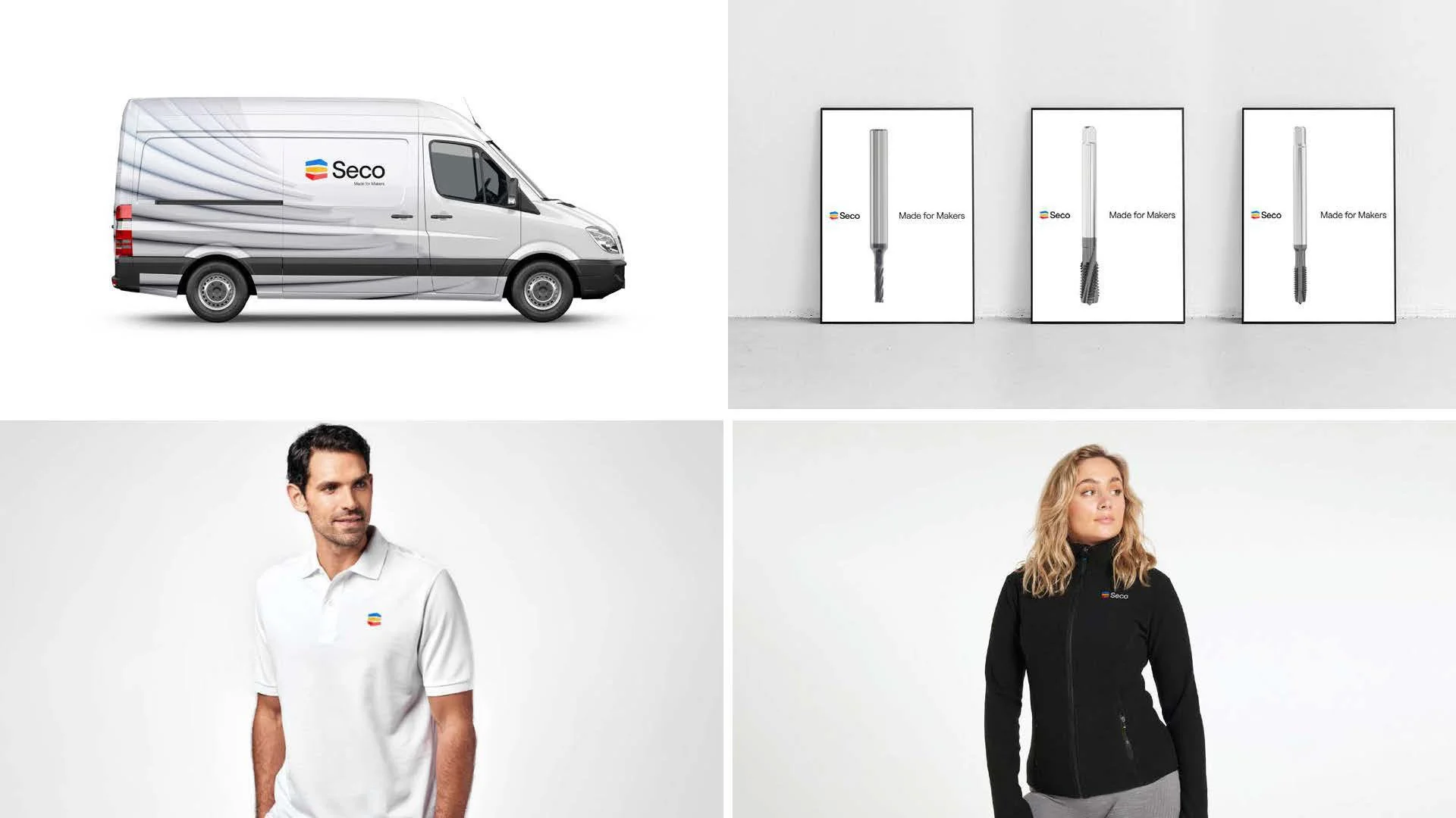
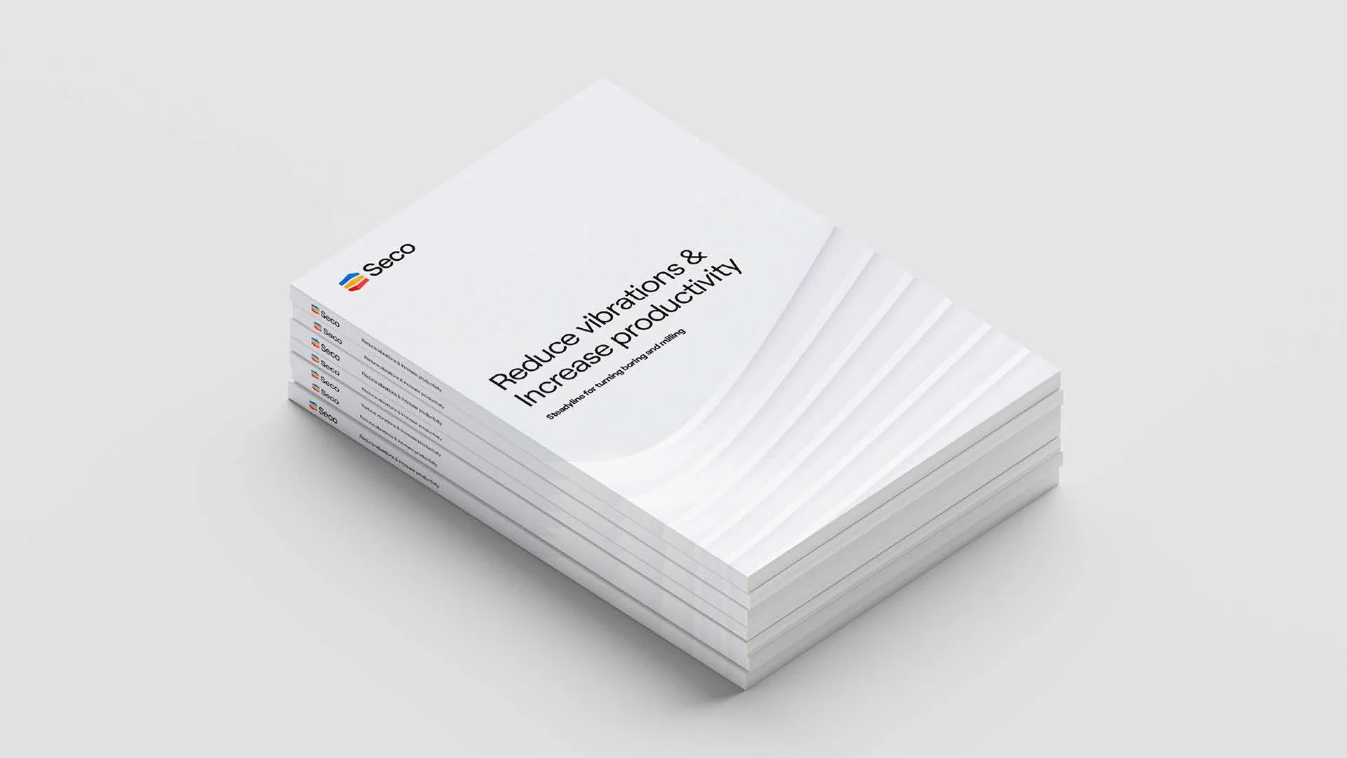
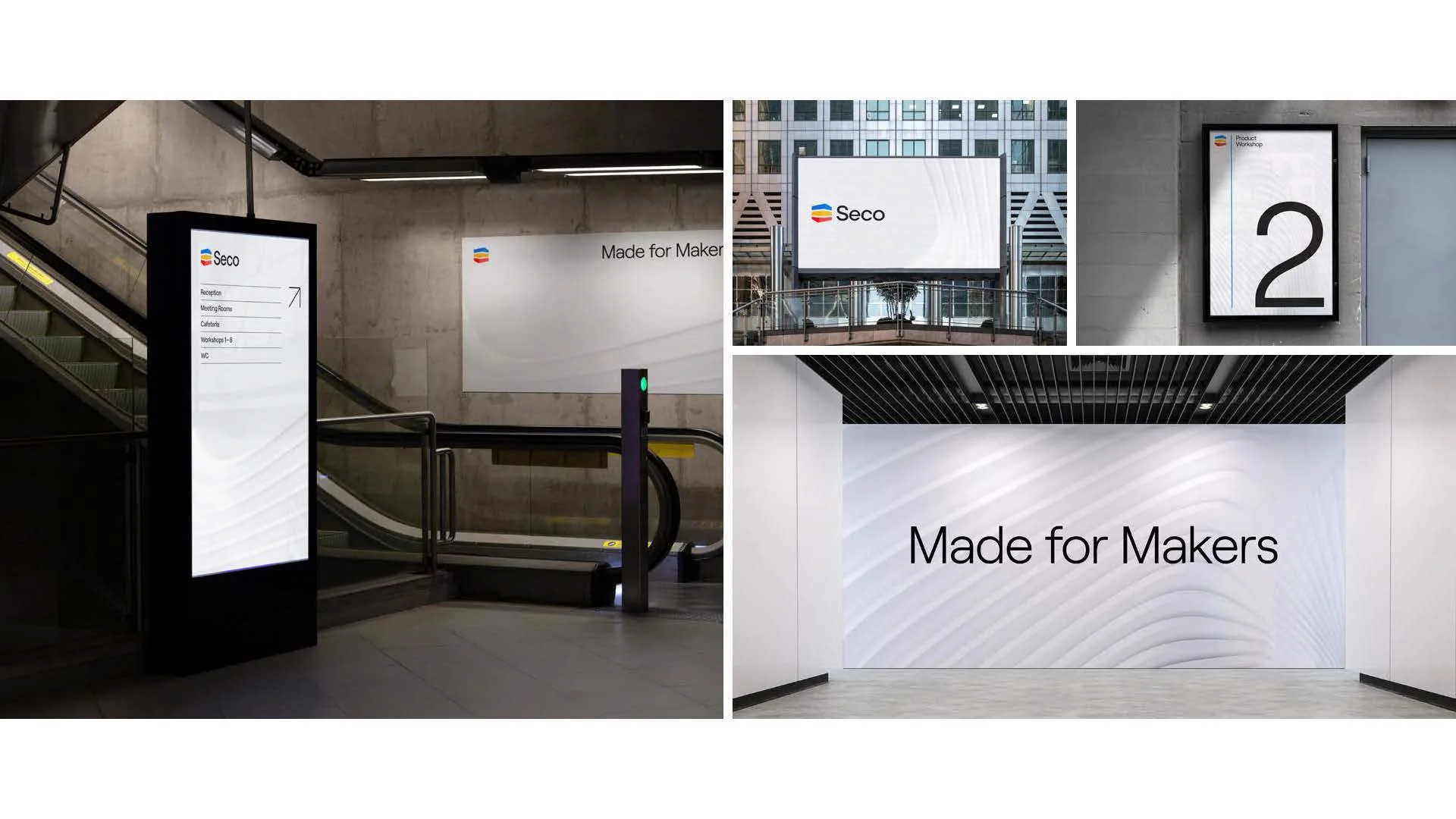
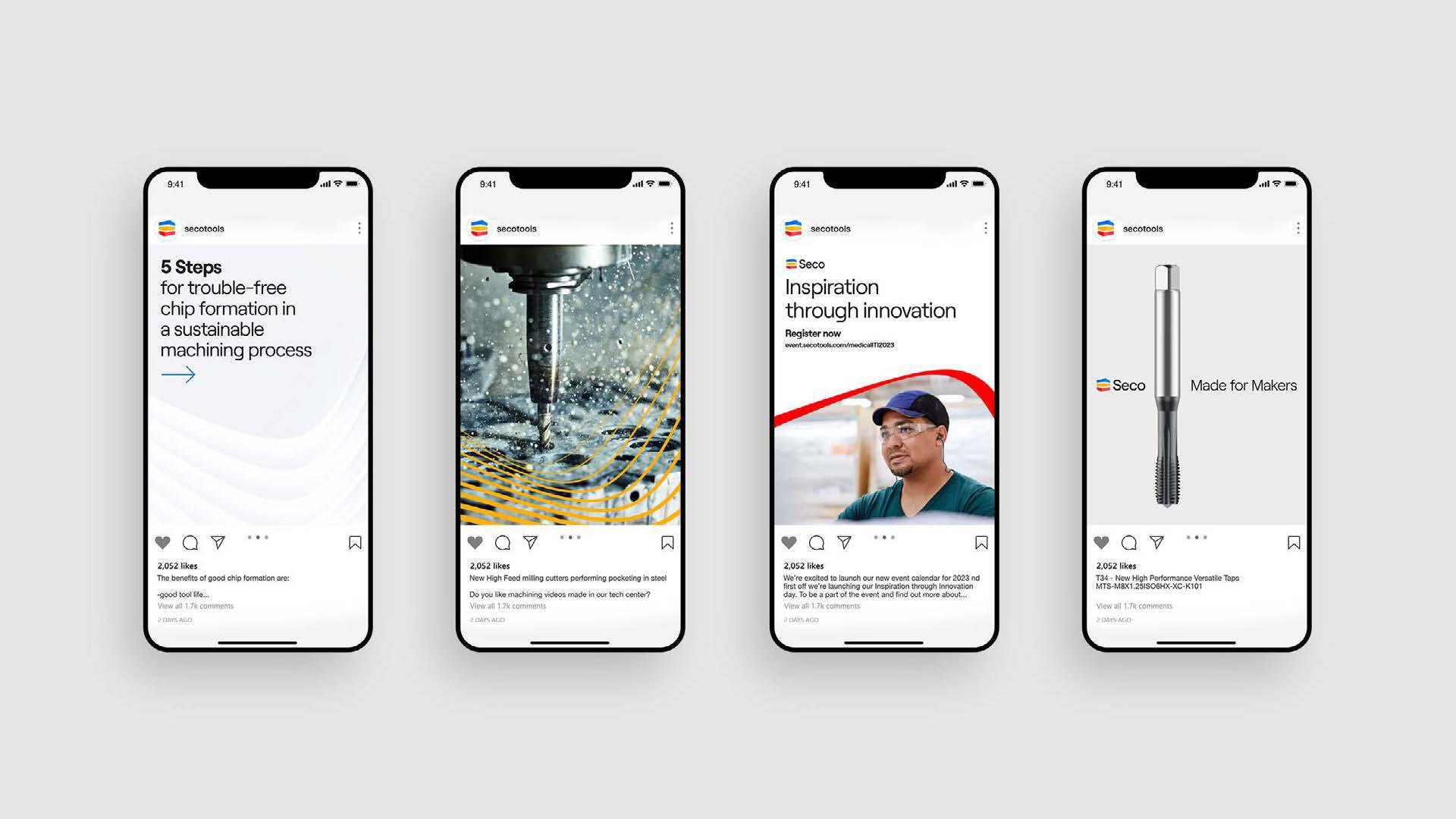
The project was already underway when the rebrand started, with a strong strategic foundation already in place. The challenge was to bring that vision to life through a fresh and refined visual identity across every brand touchpoint. In a sector that can often feel heavy and overly serious, the direction leaned into simplicity, clarity, and a more contemporary energy. The result is a brand that feels lighter, sharper, and more approachable, built around one simple idea: less is more.
-
![Seco mockups]()
02
-
![Catalogues and brochures]()
03
-
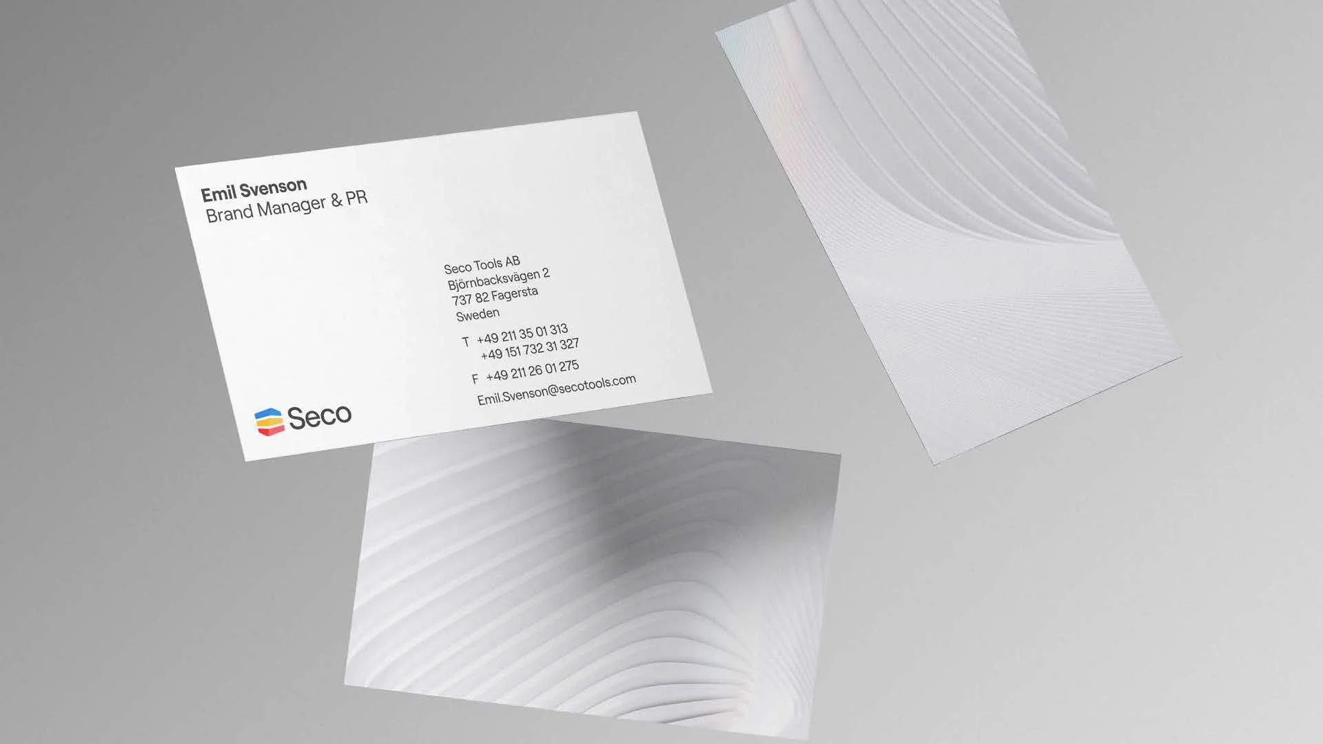
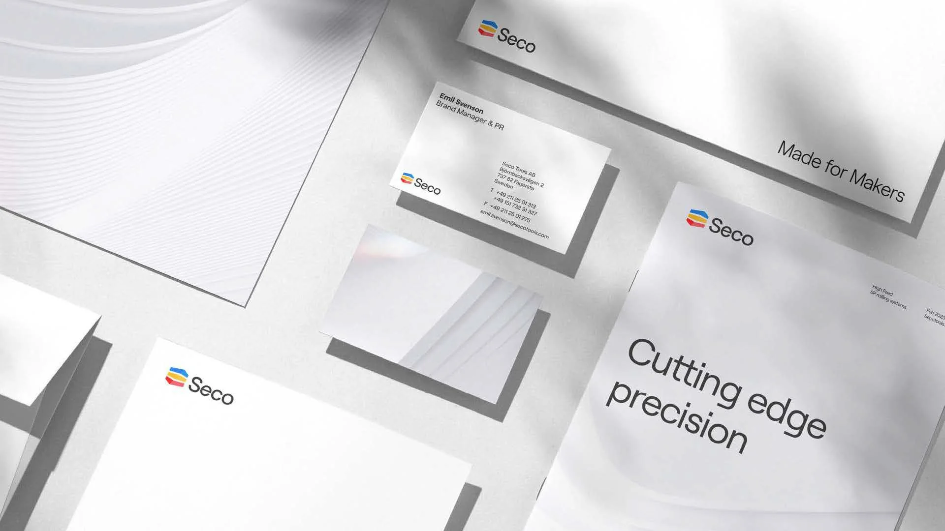
![Business card for Emil Svenson, Brand Manager & PR at Seco Tools AB, with contact details and abstract background design.]()
06